Here is a fact we’d like to start with. A news publishing site can’t survive just with various features for the app. Making significant efforts and considering the popular design updates becomes mandatory for news site owners. With the increasing number of online news publishing sites, standing out of the lot becomes essential and exacting at the same time. The news publishing industry is not just about following the ongoing trends, it is also about becoming trendsetters with creativity! All the news site owners are adapting to the latest graphic trends to grow bigger and better.
The last thing a publisher would want is losing his potential readers in spite of having unique and interesting content. The small screen of a mobile device holds the world in it! It’s time or you to utilize the latest graphic trends and design trends to add engaging elements to the news world. Give a splendid experience with a highly interactive news app. The popular design updates for 2021 are here!
SPOILER ALERT!
2021 will offer dark mode, feature-rich and highly customisable Experience! This is the year for dope designs, fun with emojis and a variety of visuals!
Excited already? Here is your trump card to build a news app with the latest design trends for your audience. Let’s dig in with the top 8 tips that you can’t miss out on!
More Screen time with variety of screen modes

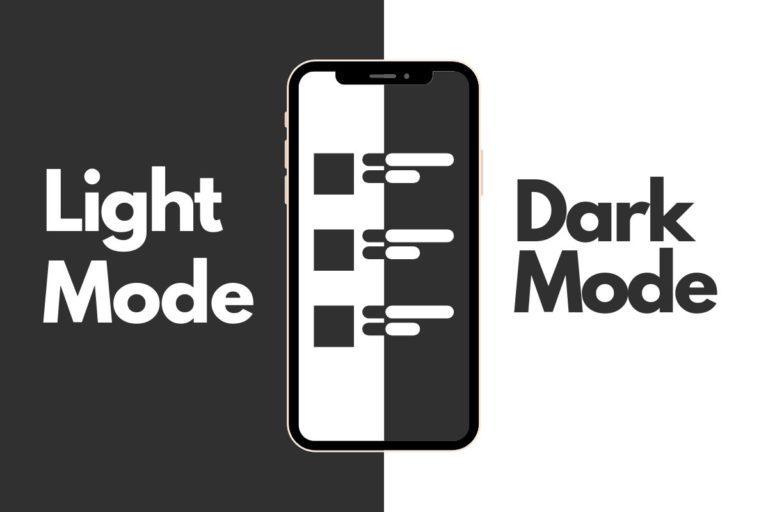
2021 is all about thinking with the extremities of dark and light! User comfort should always be a priority for news publishers. With increasing screen time for users, giving a comfortable experience to the eyes has become a must. Dark modes on your website will bring brightness to your user’s experience. Apart from being a trending choice, dark modes help reduce eye strain, providing an ultra-modern and classy look.
Become Trendsetters with Flamboyant Colors
Whether it is a dark mode or a light mode, your choice of colors make a significant impact on the number of visitors. With the right choice of colors and the perfect blend, you can design a cool website that will enhance your visual ergonomics. Unlike 2020, 2021 can be a colorful year with creative layouts for appealing online presence for news site owners. You can begin with creating layouts including rich colors with contrast to the background. Give your brand an identity to stand out from the crowd with flamboyant colors. Always remember, your brand presence shouldn’t overwhelm the eye, rather it should become an eye-catcher.
Text, Audio, Video, Action!

Text is essential, videos are attractive and audio gives the required connection to the audience. So, in a nutshell, you can’t miss out on any one of these. Quantity content on your website is no good if it fails to deliver quality. We all know that video content works better than the usual textual content. With the latest design trends, storytelling with videos, audios and textual content, add extra personality to your news app defining your own design trends!
Engage, Involve, Evolve with Dynamic Content
Dynamic content brings you a dynamic audience! Readers love to share their opinions regarding the ongoing news updates. A news site that allows the users to engage with the content has high chances to create more loyal readers and generate more revenue. It is always a good practice to engage with the users with various elements like:
- Live blogs with a comments section
- Captivating Polls for their valuable opinions
- Scorecards for live sports updates
- Daily astrology updates and more
Design Trends Fun with Emojis

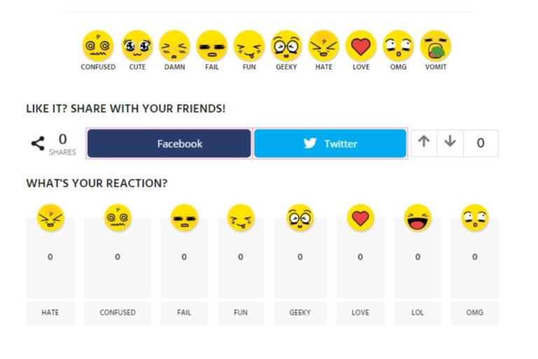
Emojis have become a second language for people to express themselves online. With the increasing popularity of emojis, the way of online communication has transformed. These playful emojis used in messaging, forums, mailers and more have become an asset for web designers to add the humor and fun element to their work. Making the most of these illustrated gestures can easily reflect your brand sentiment and develop a connection with your website visitors. On the top, emojis don’t define any language, emojis are a language itself. Hence, reaching out audience speaking different languages also becomes easy with a fun element.
Micro Animations for Macro Impressions
Micro animations include stuff like gifs and small videos. As they say, big things come in small packages, these micro animations can do wonders as they are highly interactive. You wish to convey a message or get the user’s attention within a short span of 2-5 seconds? A micro animation is a saviour that allows you to use all your creativity with intriguing elements and makes your website more stylish and interactive with a fun element to it.
Bold Fonts for Bold Content
The traditional way of content consumption with newspapers was not very user friendly for everyone. People with weaker eyesight or any other challenges would find it annoying to adjust to the small fonts on the printed papers. The most suitable go-to font style or size when it comes to getting innovative depends on the user’s choice A news site that allows users to read stories in the font of their choice is a winner already. If you haven’t done this yet, it is high time to get creative with fonts!
Customization for Customer Satisfaction
Customization is the key to a user’s mind, heart and home screen. With highly customizable themes, presenting content like blogs, articles, live news updates and more becomes a fun process! The depth and ease in browsing provided by customization draw more user attraction and interaction. How about providing different layouts like bottom tabs, horizontal menu and more to display content flawlessly? The more content you show, the more users will click on it! Blend it with various category sequences, design customizable, menu options and voila! Your potential customers will be your brand lovers in no time! Don’t believe yet?
Try out Readwhere CMS and give your news app a competitive edge with a complete makeover!


